
The following IELTS Academic Writing Task 1 questions are taken from recent IELTS exams. If you are preparing for the Academic IELTS or planning to take the test soon, practise those samples and submit a worth sharing answer in the comment section. If you have recently taken Academic IELTS test, you can share your Writing Task 1 question in this section.
Recent IELTS Graph 1:
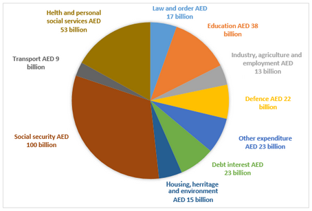
The chart below shows how much money is spent in the budget on different sectors by the UAE government in 2000.
Summarize the information by selecting and reporting the main features, and make comparisons where relevant.
Recent IELTS Graph 2:
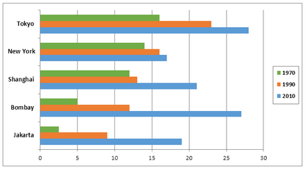
The charts below show the growth in the population in some of the world’s largest cities as well as the population distribution in urban and rural areas.
Summarize the information by selecting and reporting the main features, and make comparisons where relevant.
Recent IELTS Graph 3:
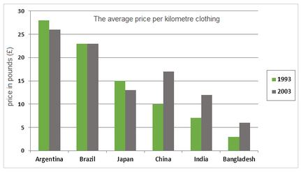
The average prices per kilometre of clothing imported into the European Union from six different countries in 1993 and 2003 are shown in the bar chart below.
Summarize the information by selecting and reporting the main features, and make comparisons where relevant.
Recent IELTS Graph 4:
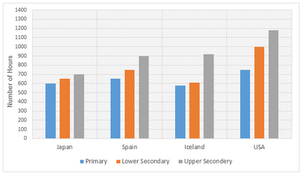
The bar charts below show the number of hours each teacher spent teaching in different schools in four different countries in 2001.
Summarize the information by selecting and reporting the main features, and make comparisons where relevant.
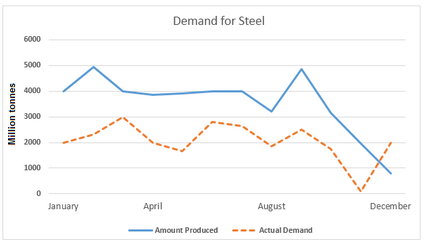
Recent IELTS Graph 5:
The line graphs below show the production and demand for steel in million tonnes and the number of workers employed in the steel industry in the UK in 2010.
Summarize the information by selecting and reporting the main features, and make comparisons where relevant.
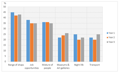
Recent IELTS Graph 6:
The bar charts and line graph below show the results of a survey conducted over a three-year period to discover what people who live in London think of the city.
Summarize the information by selecting and reporting the main features, and make comparisons where relevant.
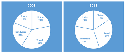
Recent IELTS Graph 7:
The pie charts below show the online sales for retail sectors in New Zealand in 2003 and 2013.
Summarise the information by selecting and reporting the main features, and make comparisons where relevant.
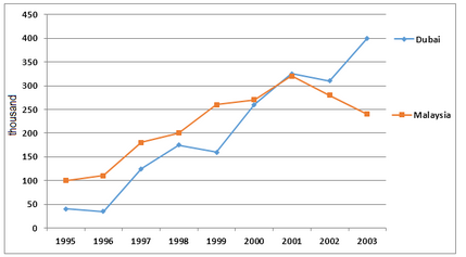
Recent IELTS Graph 8:
The number of tourists visiting Malaysia and Dubai from 1995 to 2003 is presented below.
Write a report for a university lecturer describing the information shown in the diagrams below.
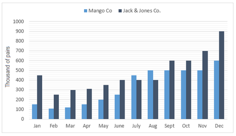
Recent IELTS Graph 9:
The bar chart below shows the estimated sales of jeans for two companies next year in Turkey. The pie chart shows the projected market share of the two companies in jeans at the end of next year.
Summarise the information by selecting and reporting the main features and make comparisons where relevant.
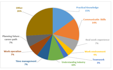
Recent IELTS Graph 10:
The graph below shows a survey result of 4000 participants who expressed what important aspects they have learned from the internship they have completed.
Summarise the information by selecting and reporting the main features and make comparisons where relevant.
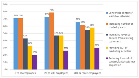
Recent IELTS Graph 11:
The graph below shows the top priorities by business companies in the USA in 2016.
Summarise the information by selecting and reporting the main features and make comparisons where relevant.
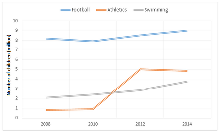
Recent IELTS Graph 12:
The graphs below show the average monthly expenditure on children’s sports and participation in different sports in the UK from 2008 to 2014.
Summarise the information by selecting and reporting the main features and make comparisons where relevant.
Recent IELTS Graph 13:
The pie charts below show the online shopping sales for retail sectors in Australia in 2010 and 2015.
Summarise the information by selecting and reporting the main features and make comparisons where relevant.

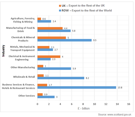
Recent IELTS Graph 14:
The bar chart below shows Scotland’s exports to the rest of the UK and the rest of the world for the year 2014.
Summarise the information by selecting and reporting the main features and make comparisons where relevant.
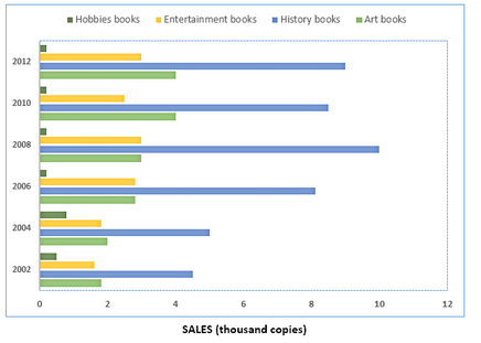
Recent IELTS Graph 15:
The chart below shows the changes in sales of four different types of books from 2002 to 2012.
Summarise the information by selecting and reporting the main features, and make comparisons where relevant.
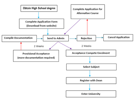
Recent IELTS Graph 16:
The diagram shows the procedure for university entry for high school graduates.
Summarise the information by selecting and reporting the main features, and make comparisons where relevant.
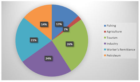
Recent IELTS Graph 17:
The chart below shows Morocco’s income from different economic sectors in 2003 as well as its income from fishing from 1982 to 2003.
Write a report for a university lecturer describing the information in the charts below.
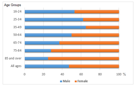
Recent IELTS Graph 18:
The bar chart below shows the proportions of English men and women of different ages who were living alone in 2011. The pie chart compares the numbers of bedrooms in these one-person households.
Summarise the information by selecting and reporting the main features and make comparisons where relevant.
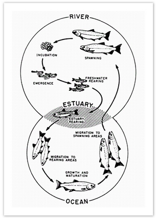
Recent IELTS Graph 19:
The diagram below shows the life cycle of a salmon, from egg to adult fish.
Summarise the information by selecting and reporting the main features and make comparisons where relevant.
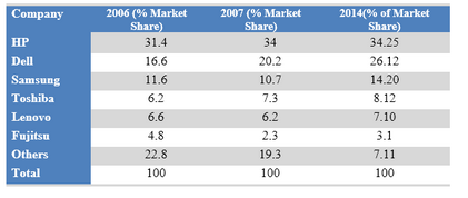
Recent IELTS Graph 20:
The table below shows the worldwide market share of the notebook computer market for manufacturers in the years 2006, 2007 and 2014.
Summarise the information by selecting and reporting the main features and make comparisons where relevant.
No comments:
Post a Comment